SCHOTTLER & SIMON
Corporation identity and webdesign
Schottler & Simon GmbH is a ten years old company which developed different businesses around customer care services. This society runs, for example, several call-centers, software development units, counseling programs, as well as a press cell (See SQUT® Magazine).
As the main graphic designer of the company, I was led to work with them on various kinds of communication devices and productions. Here are samples of this long collaboration.
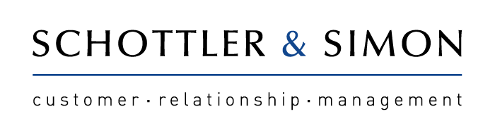
The logotype Schottler und Simon was conceived to look the most neutral and corporate way. It is only made of text, the main font representing the seriousness of a dignified institution. The blue is used for its conservative connotation.
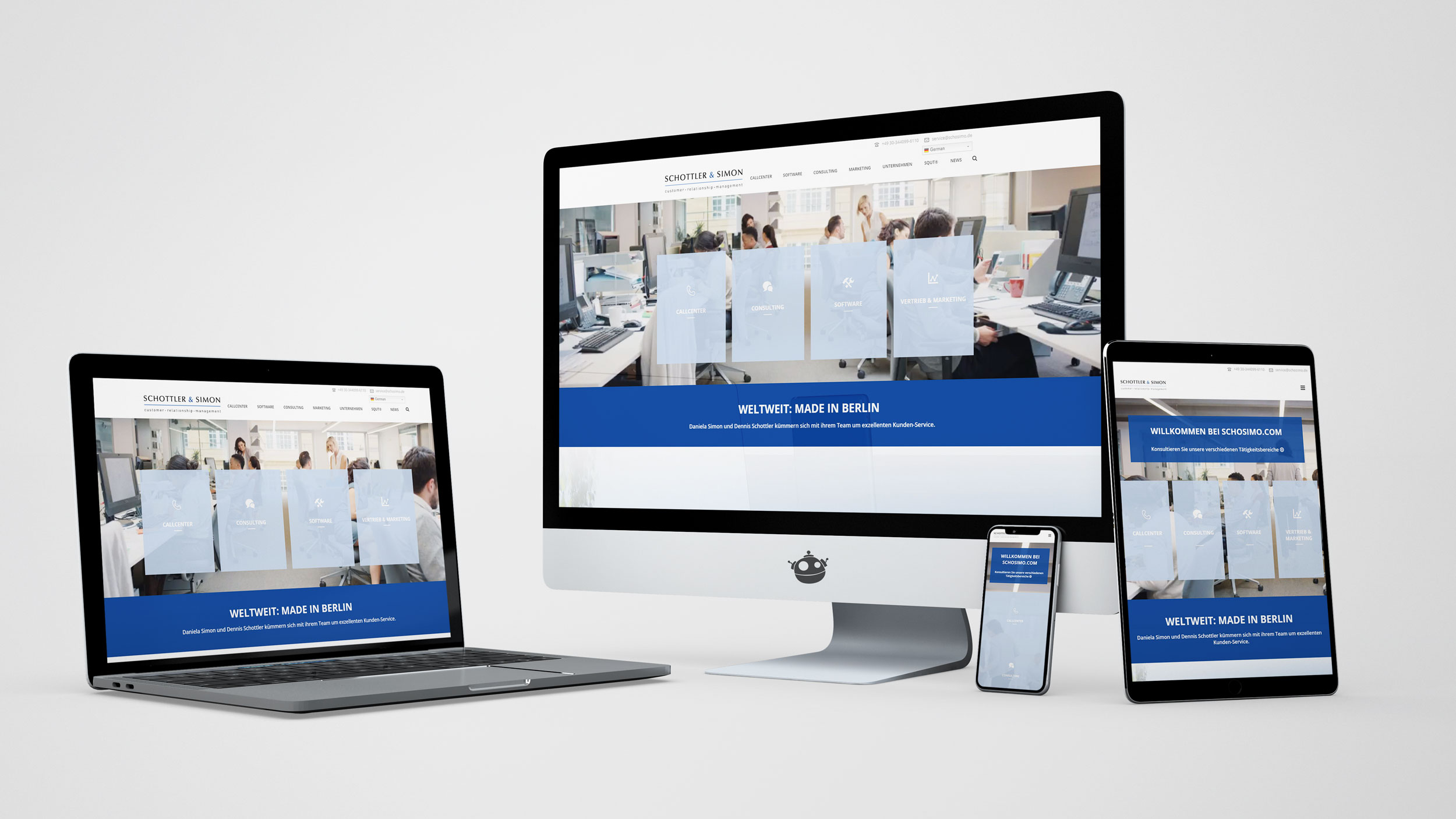
The website has to be a showcase for the company, exposing and detailing its business structure and the wide range of its services. In the end, this website contains ; a didactic homepage, three tens of landing pages, two blogs and a digital library.